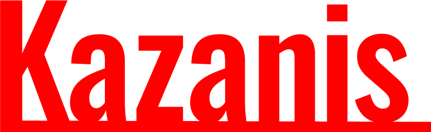
Primary Wordmark


Design Notes
This is the simple system behind my work. A few choices I repeat on purpose so my projects feel like they come from the same brain.
Brief
Make work that feels bold, clear, and a little playful. No extra steps. No mystery meat.
I like making things that feel like real objects. Posters, VHS slip covers, weird little interfaces, and websites that look like a place you can hang out in.
My rule is simple. Design should communicate fast and feel intentional. If it does not help the message, it gets cut.
This identity is a small toolkit. Strong color, loud type, dark panels, and clean spacing. It keeps my projects consistent while still letting each one have its own personality.
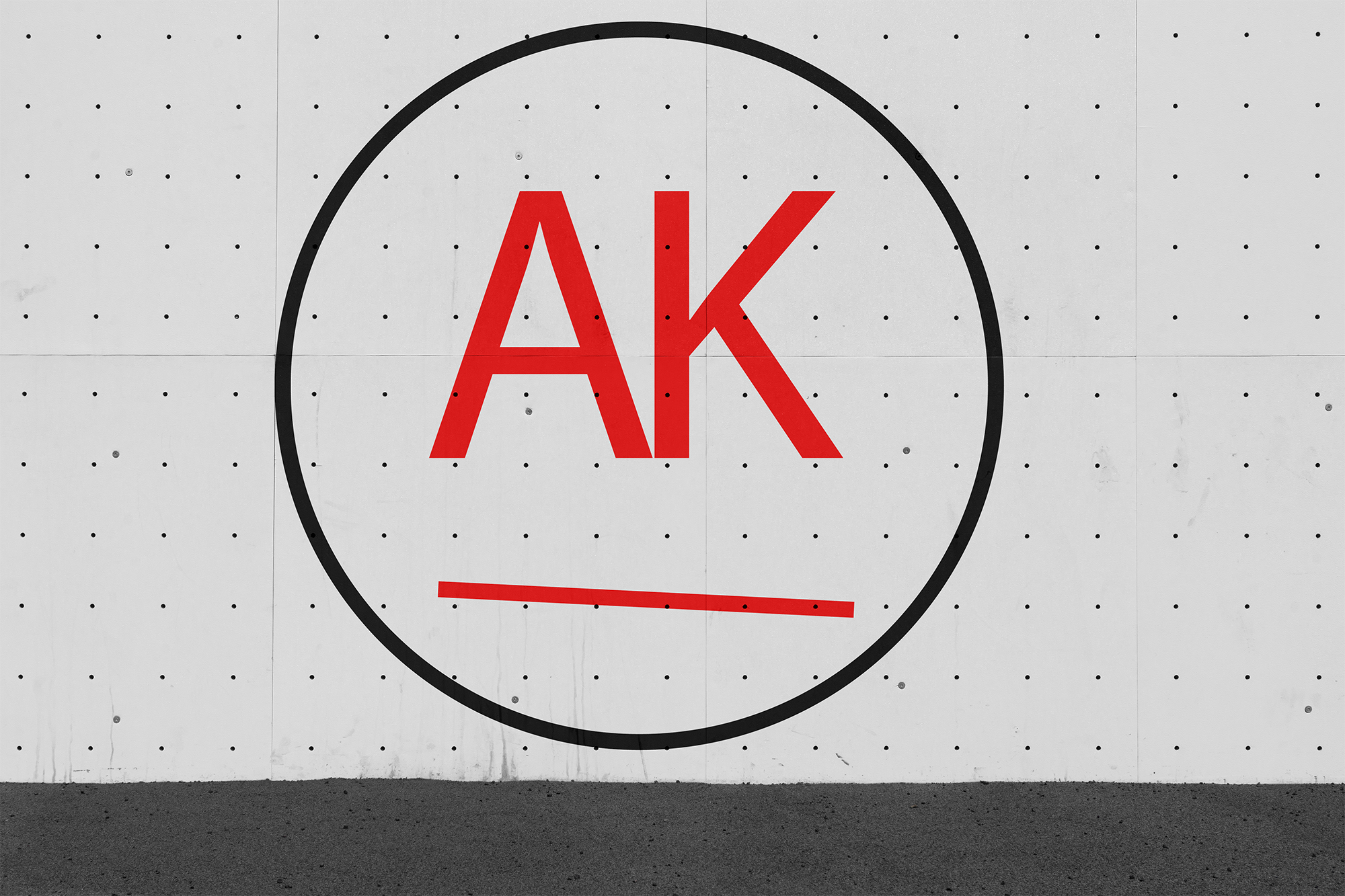
Identity
The wordmark is the main character. The logomark is the backup plan.
Rules
Give it breathing room. Keep it readable. Do not get clever in the wrong places.
Rule of thumb. If it feels cramped, it is.
Minimum height is 30px. If it is smaller, use text.
Color
Orange is the voice. Blue is the structure. Red is the punchline.
#FF6B00
#0047AB
#FF0000
Type
Big headings. Clean body text. Easy to read, hard to ignore.
DREW KAZANIS
PROJECT NOTES
SYSTEMS AND STORIES
This is what body copy looks like on my site. Clear, simple, and friendly.
Bold is for emphasis, not decoration.
If it is hard to scan, it is not done yet.
In Use
This is the same system across posters, mockups, and web stuff. Just adjusted for the job.