Creative Brief
Making cool things is at the heart of what I do as a designer, whether it’s crafting VHS slip covers or building engaging websites. My approach centers on a core belief: design should solve problems and communicate clearly, without unnecessary complexity.
My brand identity reflects this straightforward approach. The bold color choices – vibrant orange, deep blue, and striking red – aren’t just visually appealing; they’re strategic tools for communication. Similarly, the typography pairing of Archivo and Oswald balances professionalism with personality.
Each element serves a purpose — guiding attention, clarifying information, or creating visual impact with intention.
Identity System
Primary Wordmark

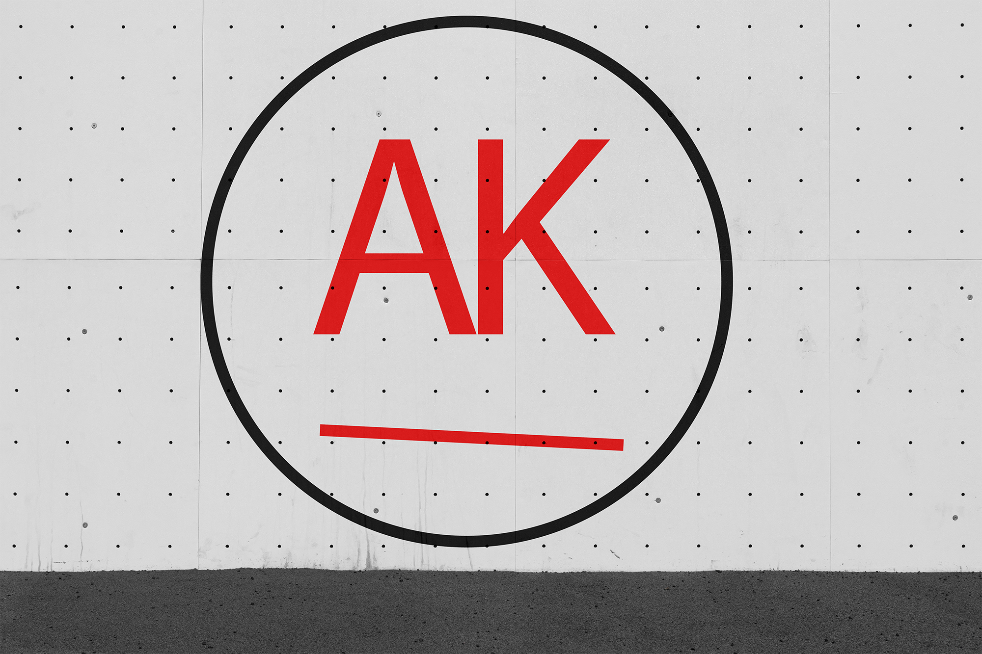
Logomark

Logo Guidelines
Construction & Clear Space
Minimum clear space = height of “K”
Minimum Size
Minimum size: 30px height
Color System
Vibrant Orange
#FF6B00
Deep Blue
#0047AB
Accent Red
#FF0000
Typography
Archivo
PrimaryRegular: Aa Bb Cc Dd
Medium: Aa Bb Cc Dd
Bold: Aa Bb Cc Dd
Oswald
SecondaryRegular: Aa Bb Cc Dd
Medium: Aa Bb Cc Dd
Bold: Aa Bb Cc Dd
Applications
Wall Graphics

Billboard